Enhancing the TV guide for the big screen

Role
Sr Product Designer — Research, visual design
Team
PD, UXW, UXR, PO, Engineering, CX, Business
Timeline
4 weeks

The approach
We broke the problem into key areas to enable focused exploration, faster prototyping and clearer decision making.
We combined multiple research inputs, including previous studies on live TV and replay behaviors, analytics, surveys, interviews and testing to evaluate concepts and interaction patterns. Some insights that influenced the solution:
Users experienced decision fatigue as content libraries grew.
Viewing decisions relied on rapid scanning rather than detailed metadata.
The guide needed to support multiple viewing behaviors within the same household.
The Solution
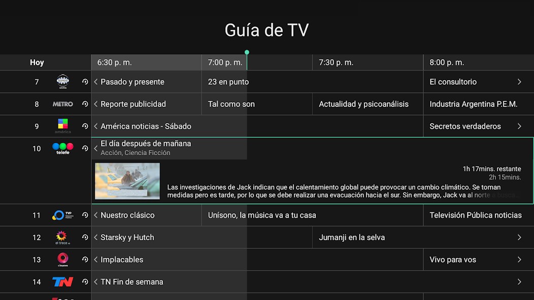
Quick scanning: We reduced unnecessary metadata and prioritized the information users need most: channel recognition, timing, and what is currently airing. Visible time markers and prominent channel logos improved scanability while preserving readability from a distance.
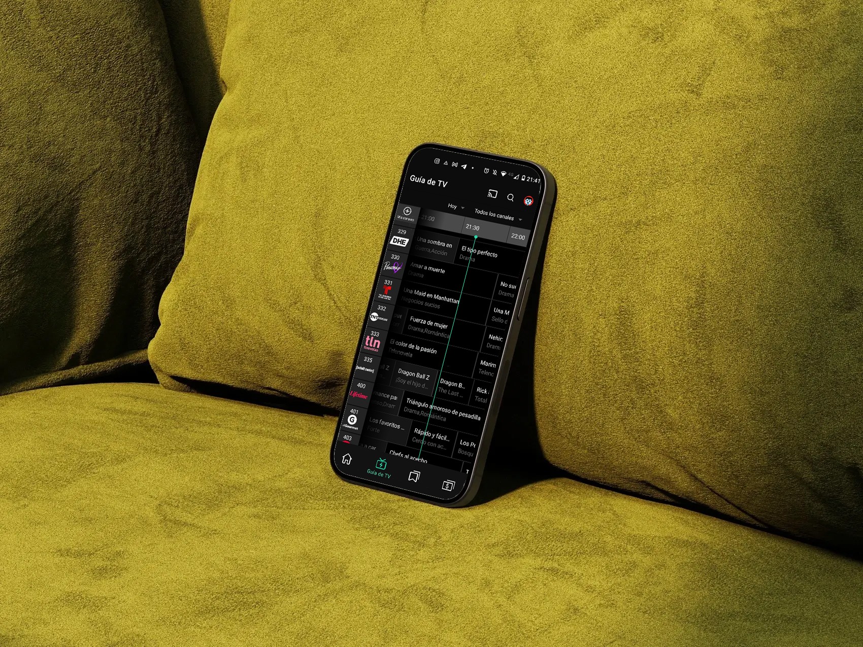
Content filtering: Research showed that most users repeatedly browse a small set of familiar channels and content types. To reduce noise and navigation friction, we introduced channel filtering, allowing users to quickly narrow the guide based on their viewing preferences.
Browsing past and upcoming programming: We redesigned navigation across past and upcoming programming, making replay content easier to browse while keeping live content prominent. A persistent GO TO LIVE action allowed users to quickly return to the current broadcast.
The Outcome
The redesign aligned the TV guide with familiar viewing behaviors and created a more consistent experience across devices.
Reduced TV guide-related support tickets by ~27% (support ticket volume).
Improved content discoverability across live and replay TV (task success rate, findability scores).
Reduced navigation effort when browsing programming (time on task and navigation steps).
MORE ProjectS

